


In today’s digital age, where people access websites on a wide range of devices, from smartphones to large desktop monitors, ensuring a seamless and consistent user experience is paramount. This is where responsive design comes into play. Responsive design is not just a trend; it’s a fundamental approach to web design that addresses the diverse needs of modern users.
What is Responsive Design?
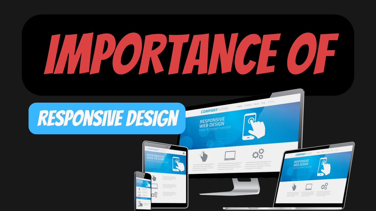
Responsive design is a design approach that aims to create websites that adapt and respond to the user’s device and screen size. In other words, a responsive website is one that looks and functions equally well on a mobile phone, tablet, laptop, or desktop computer. This approach eliminates the need to create separate websites or apps for different devices, streamlining the user experience and saving time and resources for businesses.
Key Benefits of Responsive Design:
- Enhanced User Experience: A responsive website ensures that users can access your content comfortably, regardless of the device they are using. It eliminates the frustration of zooming in and out or scrolling excessively to view content.
- Improved SEO: Search engines like Google prioritize responsive websites in search results. This means that having a responsive design can positively impact your website’s visibility and ranking in search engine results pages.
- Cost-Effectiveness: Instead of developing multiple versions of your website for different devices, responsive design allows you to maintain a single website that serves all users. This reduces development, maintenance, and hosting costs.
- Consistent Branding: With a responsive design, your branding elements, content, and user experience remain consistent across all devices. This builds trust and familiarity with your audience.
- Faster Load Times: Responsive websites are optimized for speed, which is crucial for retaining users and reducing bounce rates. Faster load times also contribute to better SEO rankings.
- Flexibility for Future Devices: As new devices with varying screen sizes and resolutions emerge, a responsive design ensures that your website is ready to adapt without major redesigns.
How Responsive Design Works:
Responsive design relies on flexible grids, media queries, and CSS (Cascading Style Sheets) to adjust the layout and presentation of a website based on the user’s device characteristics. Media queries allow the website to detect the screen size and apply different styles accordingly, such as rearranging content, adjusting font sizes, and resizing images.
Conclusion:
In a world where users engage with websites on an array of devices, responsive design is no longer optional—it’s essential. It empowers businesses to deliver a consistent and user-friendly experience across devices, which, in turn, leads to higher engagement, improved user satisfaction, and better business outcomes.
So, whether you’re revamping your existing website or starting from scratch, remember that responsive design isn’t just about aesthetics; it’s about adapting to the needs of your audience and creating a website that works for everyone, everywhere.
Leave a Reply
You must be logged in to post a comment.